Archives

Tobin-Carmany Wedding

ART DIRECTION • BRANDING • DIGITAL MEDIA • EVENT DESIGN • HAND-DRAWN ILLUSTRATION • PACKAGE DESIGN • PRINT COLLATERAL • SIGNAGE/WAYFINDING • ART DIRECTION • BRANDING • DIGITAL MEDIA • EVENT DESIGN • HAND-DRAWN ILLUSTRATION • PACKAGE DESIGN • PRINT COLLATERAL • SIGNAGE/WAYFINDING • ART DIRECTION • BRANDING • DIGITAL MEDIA • EVENT DESIGN • HAND-DRAWN ILLUSTRATION • PACKAGE DESIGN • PRINT COLLATERAL • SIGNAGE/WAYFINDING

TOBIN-CARMANY WEDDING

Event Design & Collateral

TIMELINE: 150 Days

TEAM SIZE: 2 People

Though Theresa and Austin’s wedding was 12 years in the making, the timeline for event creative was significantly tighter. Hey Moon Collective went on to create a full event design collateral package in a little under 4 months—complete with branding, signage & wayfinding, print collateral, digital advertisements, swag, and a fully animated web experience.

This engagement is the perfect example of a ‘full design support’ event package. It showcases how design can make your events memorable, meaningful, and lend a sense of overall cohesion to the space.

The engagement kicked-off with initial brand exploration. We got a sense of the look/feel the couple was hoping to achieve, and also conducted several exercises to find ways of tying in their unique love story into the branding. Little easter eggs were peppered into their brand color palette, and supplemental hand-drawn illustration system so every ounce of the event design felt significant.

Our team wanted to ensure the logo was flexible, functional, and beautiful. We crafted the full mark for the majority of use case scenarios, and developed an additional condensed mark for small spaces like social media profile photos. The base of the logo was set in Neil Summerour’s Lust Script, and modified to mix and tangle with hand-drawn local foliage.

Hey Moon Collective designed small table-top signage for the event so attendees could quickly scan offerings and navigate the snacks, apps, and desserts. Aside from signage, the team also designed some unique items like the cake itself with each point of the gradient Pantone color-matched for quality assurance.

Leading up to the event, Hey Moon Collective launched a social media campaign targeting attendees. The purpose of the campaign was to keep them updated on event news and inform them of other activities in the area—something that would be crucial for those visiting from out of town. Posts ran on Facebook, Instagram, and X.

The large-format in-person signage package included several easels, a-frames, and a unique seating chart installation. All large format signage leveraged the primary event gradient to create a sense of cohesion in the space and allow the specific accent colors that have been peppered in to really shine.

Attendees received a kiss-cut sticker sheet and brochure as their event swag; however, the couple requested something a little different. The couple wanted to take home a custom 2-disc vinyl featuring the soundtrack to their love story. The packaging itself included custom artwork to make it feel even more significant.

Once attendees received their save-the-dates, they were redirected to the event website that acted as the single-source of truth for everyone planning their trips. It included all the most important information—from day-of itinerary and navigation details, to menu and dress code.

The website was designed as an intentional extension of the brand identity, with thoughtful animation details to bring the illustrations to life and generate excitement for the upcoming event. The aim was to make it beautiful, informative, and accessible—so anyone could use it.

hey,

let's create together

Like what you've seen?

We would love to learn more about your engagement! Connect with our team to learn more about our service offerings, pricing, and location details. We’re looking forward to making magic together!

AATF Philadelphia

ART DIRECTION • USER INTERFACE DESIGN • USER EXPERIENCE DESIGN • WORDPRESS SITE DEVELOPMENT • SITE MAPPING • ACCESSIBILITY • RESPONSIVE DESIGN • DIGITAL MEDIA • GRAPHIC DESIGN • ART DIRECTION • USER INTERFACE DESIGN • USER EXPERIENCE DESIGN • WORDPRESS SITE DEVELOPMENT • SITE MAPPING • ACCESSIBILITY • RESPONSIVE DESIGN • DIGITAL MEDIA • GRAPHIC DESIGN • ART DIRECTION • USER INTERFACE DESIGN • USER EXPERIENCE DESIGN • WORDPRESS SITE DEVELOPMENT • SITE MAPPING • ACCESSIBILITY • RESPONSIVE DESIGN • DIGITAL MEDIA • GRAPHIC DESIGN

AATF PHILADELPHIA CHAPTER

Website Design

TIMELINE: 6 Months

TEAM SIZE: 3 People

The American Association of Teachers of French (AATF) is an organization devoted to the maintenance of the highest standards of culture among teachers—to study and apply the best methods of instruction.

The Philadelphia chapter approached Hey Moon Collective looking for creative support on their upcoming website redesign. The team collaborated with the chapter president and walked through the full creative process—from site mapping and wireframes, through prototyping and the final web build.

Visit the Live Website >
Our chapter’s website was something we had always wanted to upgrade. Based on a referral, I reached out to see how they could help, and I couldn’t be more astonished with the final product! Our website turned out amazing and looks even better than the main organization’s. I’m thrilled with their professionalism, thoroughness, and care about making sure that every page was perfect. We would not have gotten this done without Hey Moon!

— Jean M. Copeland

Chapter President, AATF Philadelphia

The new site’s look/feel was heavily influenced by the parent chapter’s website. Our team wanted to ensure we were adhering to the parent brand standards for a full sense of visual cohesion. By pulling base styles, Hey Moon was able to create innovative design solutions that built off the initial strong foundation.

Hey Moon’s main priority was to design a web system that was easy for the client to maintain updates after the engagement ended. Our team ran several Zoom trainings and put together a PDF guide to ensure the chapter had a seamless knowledge transfer and could keep their new beautiful site up-to-date moving forward.

hey,

let's create together

Like what you've seen?

We would love to learn more about your engagement! Connect with our team to learn more about our service offerings, pricing, and location details. We’re looking forward to making magic together!

The Enterprise Center

ART DIRECTION • BRANDING • SYSTEMS AUDIT • DIGITAL MEDIA • DESIGN CONSULTING • ART DIRECTION • BRANDING • SYSTEMS AUDIT • DIGITAL MEDIA • DESIGN CONSULTING • ART DIRECTION • BRANDING • SYSTEMS AUDIT • DIGITAL MEDIA • DESIGN CONSULTING

THE ENTERPRISE CENTER

Brand Audit & Expansion

TIMELINE: 60 Days

TEAM SIZE: 2 People

The Enterprise Center is a non-profit that supports minority entrepreneurs and under-resourced communities by advertising and delivering on transformative economic development connected to minority business growth cycles and community wealth building initiatives.

During the COVID-19 pandemic, The Enterprise Center was looking to establish a cohesive brand identity in preparation for their upcoming website redesign. Hey Moon conducted a thorough brand audit, using those findings to solidify and establish brand guidelines and expansion opportunities for the visual system.

Visit the Brand Guide >
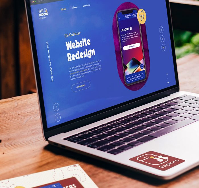
The engagement kicked-off by interviewing key stakeholders to get a sense of the culture and vision. The Enterprise Center had a logo, but no real brand guidelines to uphold and strengthen its visual presence. From there, our team audited over 50 individual pieces of collateral tracking style, type, color, and compositional queues to see which styles the organization favored throughout it’s lifespan. This audit uncovered the brand that was at the heart of their identity all along!

During the process of cementing the organization’s brand guide, our team also developed a series of sample touchpoint collateral that included letterhead, business cards, folders, presentation designs, email newsletters, annual financial reports, Zoom backgrounds, and more. The point of this design exploration was to demonstrate the new guidelines in-situation and showcase how the design system can grow and sustain visual interest as time goes by.

The Enterprise Center had a series of public engagements in 2021. As a way to give back to their organization and the community, Hey Moon Collective designed a presentation template for the organization that preserved the brand and style direction to ensure they could put their best foot forward in any scenario.

The brand identity delivered was instantly embraced by the organization. The look/feel was showcased in The Enterprise Center’s new website launch, and their social media presence was revitalized with a cohesive design system that made them stand-out in the average timeline. The branding continues to stand the test of time and represents them proudly to this day.

Like many nonprofits, it had been years since we gave our brand guide the attention it deserved—and it was starting to show. Theresa was amazing to work with: she truly took the time to understand our needs, goals, and identity. I constantly get compliments on our branding and Theresa’s clear, comprehensive guide! Whether your brand is due for a refresh, or you’ve never had one formally completed, I promise you’ll be pleased with Theresa’s work!”

— Elizabeth McGinsky

The Enterprise Center

The brand guide addressed both digital and physical applications, taking special care to showcase layout and visual options for the non-profit’s annual financial report. This item is particularly vital because it attracts a lot of attention, and represents their organization in the marketplace.

hey,

let's create together

Like what you've seen?

We would love to learn more about your engagement! Connect with our team to learn more about our service offerings, pricing, and location details. We’re looking forward to making magic together!